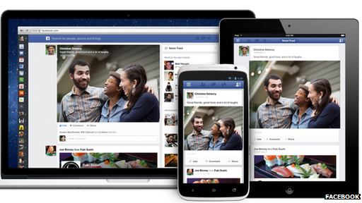
Facebook has decided to revamp its design, making its website look more like its Android and iOS mobile apps
The refresh also introduces topic-specific alternatives to its news feed.
One consequence of the change is that adverts can take up more screen space, making them harder to ignore.
However, the project’s lead engineer denied ads were the redesign’s focus. He also played down suggestions that the move was intended to make people spend more time on the site.
Chris Struhar instead suggested his focus had been on stripping back the amount of information being shown on the news feed to make each post more “engaging”.
“One of the consistent themes we heard in feedback from people was that it felt cluttered and that there was lot happening on the page,” Chris Struhar said ahead of the official announcement.
“We wanted to clean up the page, declutter it, make it simpler, more modern and easier for people to use.
“I often compare this to a 1960s television with wood panelling, knobs around it and a tiny postage stamp-sized screen – and what we’re trying to do is take that same TV and translate it into a 40in HD experience.”
Facebook reported in January that 1.06 billion people were using its service at least once a month.
It also revealed that its profit for the last three months of 2012 was 79% down on the same period the previous year despite a rise in sales because of increased spending on research and development.
There are three key changes being made to Facebook:
It is also noteworthy that the firm has now dropped its “facebook” logo which spelt out its full name, and replaced it with an “f” icon. This change had already been experienced by the selected group of users given early access to its Graph Search facility.
Facebook has decided to revamp its design, making its website look more like its Android and iOS mobile apps
Another tweak involves auto-generating maps to accompany posts about specific locations. This may encourage more members to use the mobile app’s GPS-powered check-in function which competes with Foursquare.
Investors and marketers will be keen to find out whether the alterations make users more likely to read and interact with paid content.
Facebook already knows that engagement with ads in its main news feed is greater than with those that appear on the right-hand side of its web browser. This column of adverts is absent from its mobile apps altogether.
Enlarging the news feed now allows a sponsored post to become by far the biggest element on the screen, taking up roughly a third of the page when viewed on a 13 in (33 cm) laptop display.
Another business-friendly change is that if a user “likes” an organization a horizontal banner photo is added to posts reporting the news in addition to the brand’s logo, making the update more eye-catching.
Chris Struhar acknowledged that sponsored posts from “liked” brands had become bigger, but added that it was not his intention to make users more likely to click them.
“This redesign doesn’t change anything about how people interact with ads on Facebook,” he said.
“We aren’t changing where adverts show up or what ads you see. We’re just trying to take all the content that you do see and make that bigger and more immersive and more engaging.”
Chris Struhar added that further amendments might be made once users had had a chance to provide feedback.
Three Indian nationals have been arrested and charged over the killing of Sikh separatist leader…
President Joe Biden has urged pro-Palestinian protesters on university campuses to uphold the rule of…
Blue Ivy Carter has joined the voice cast of The Lion King prequel Mufasa: The…
At least five people, including a four-month-old baby, have been killed after dozens of tornadoes…
Harvey Weinstein has been hospitalized just days after his 2020 rape conviction in New York…
Hamas has published a video showing the first proof of life of US and Israeli…